Work
Contact
CV
Murals & Signs
Work
Contact
CV
Murals & Signs
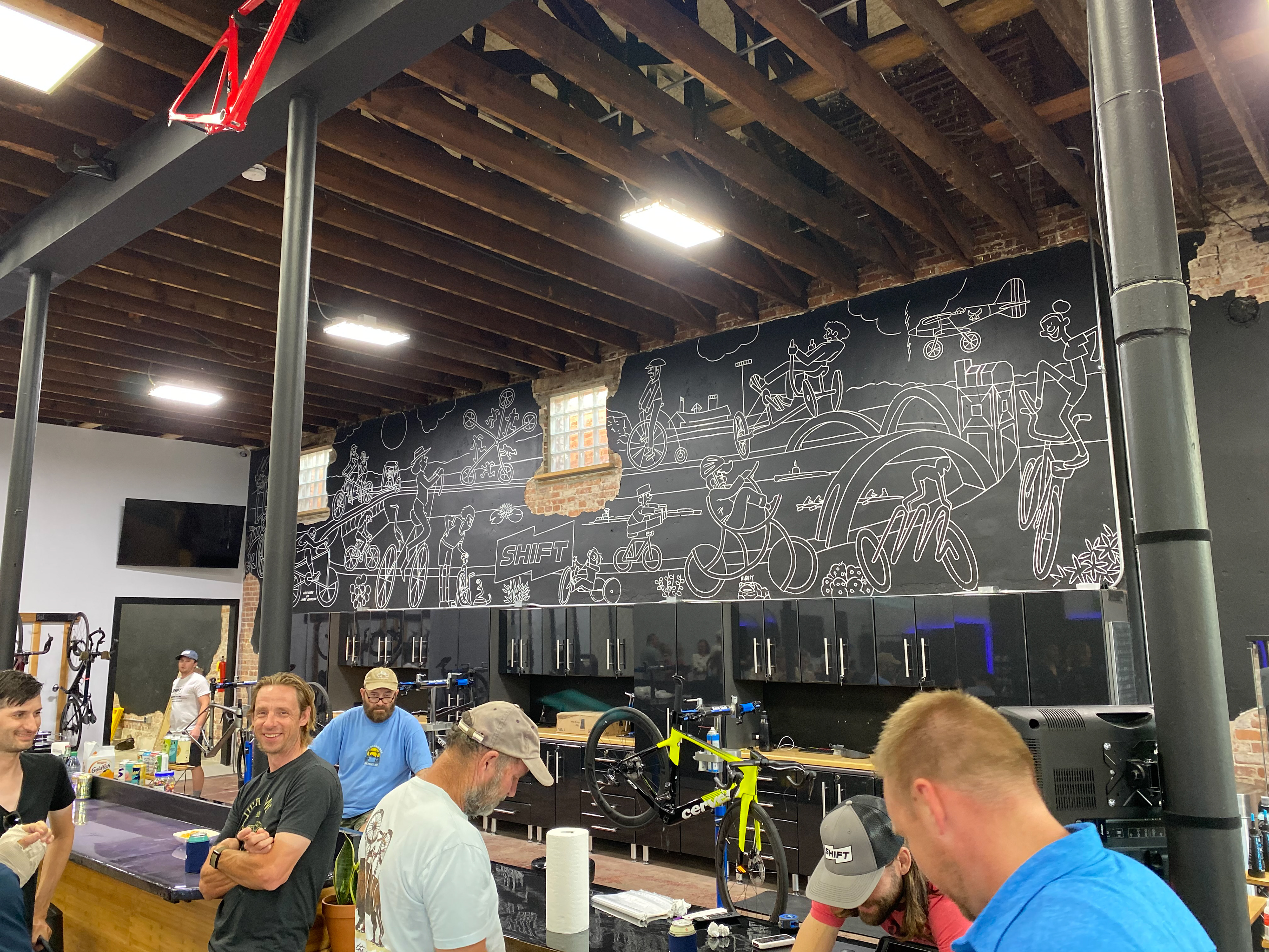
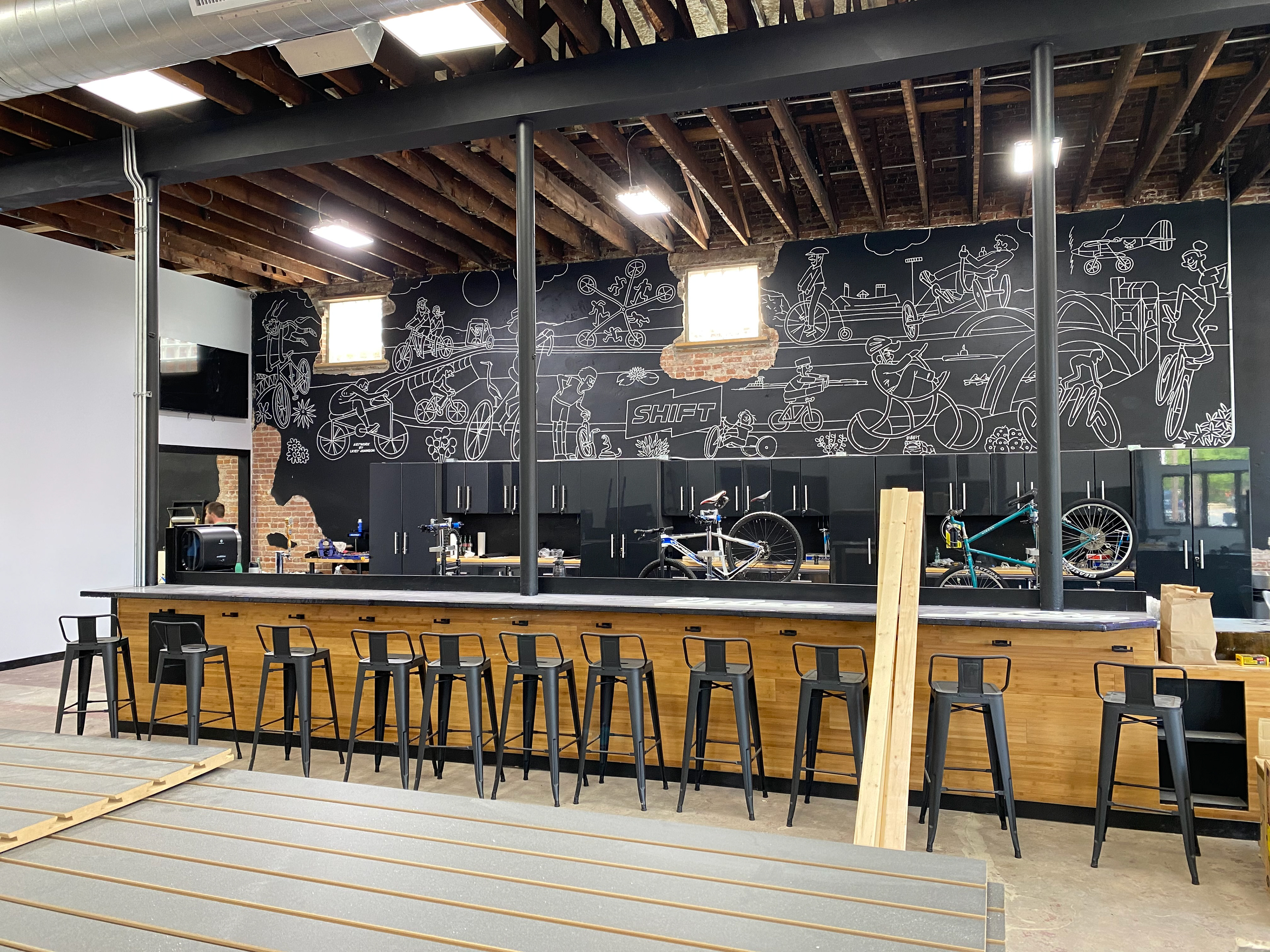
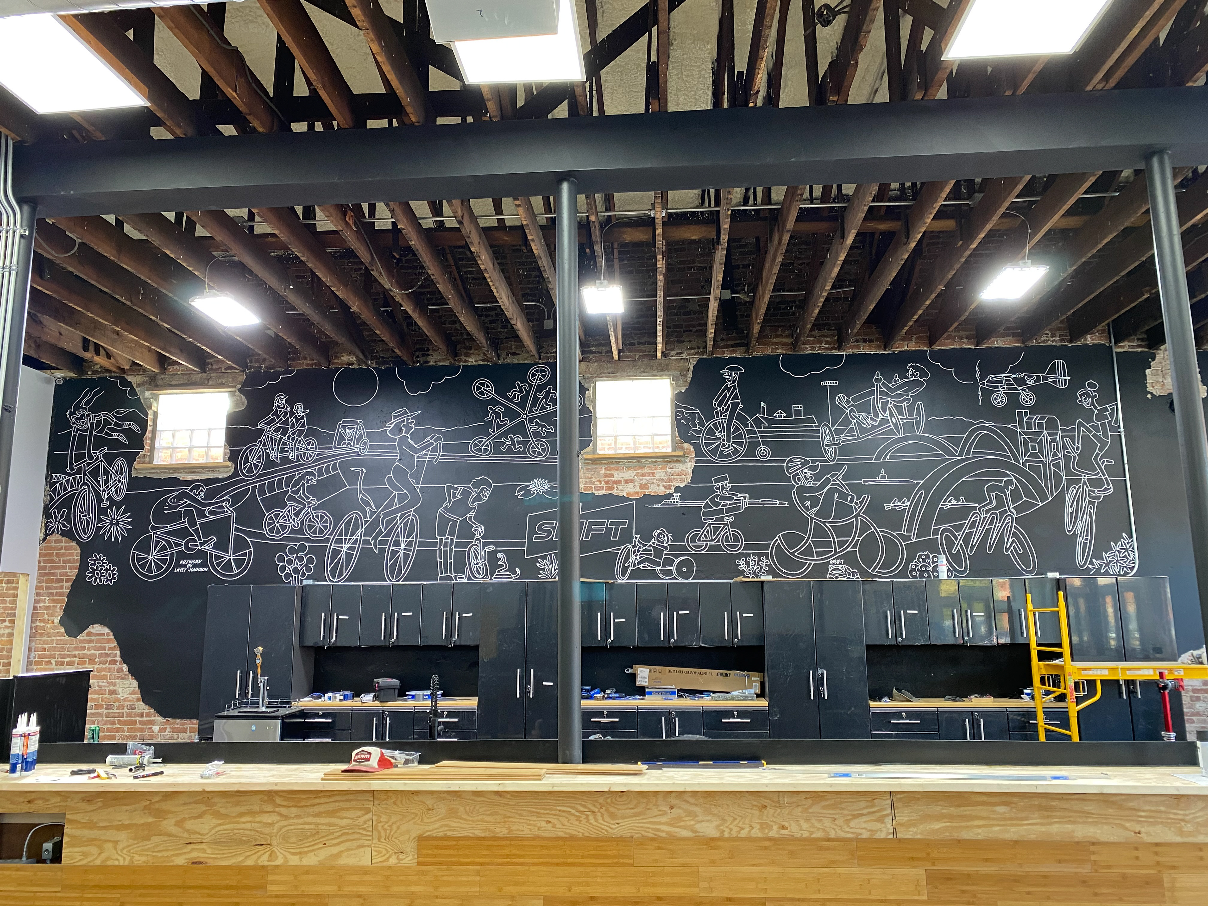
Layet Johnson
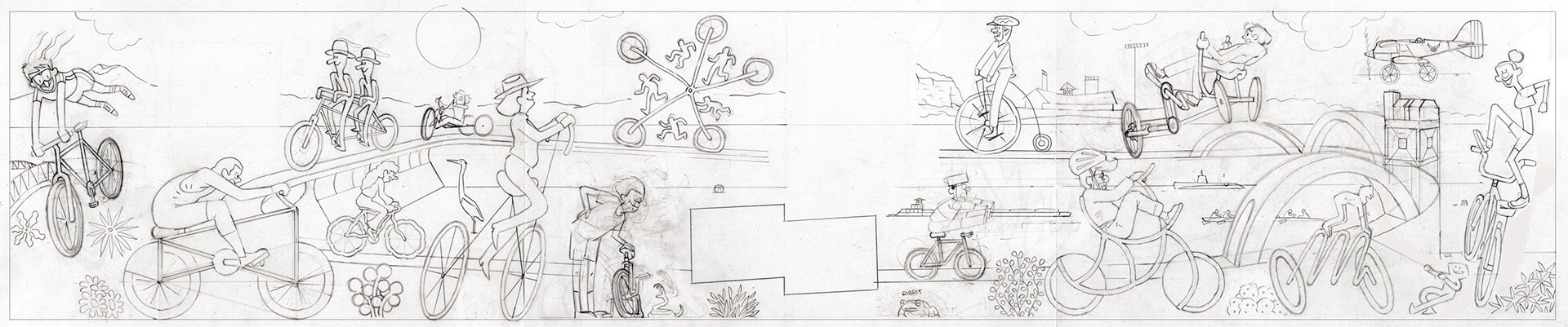
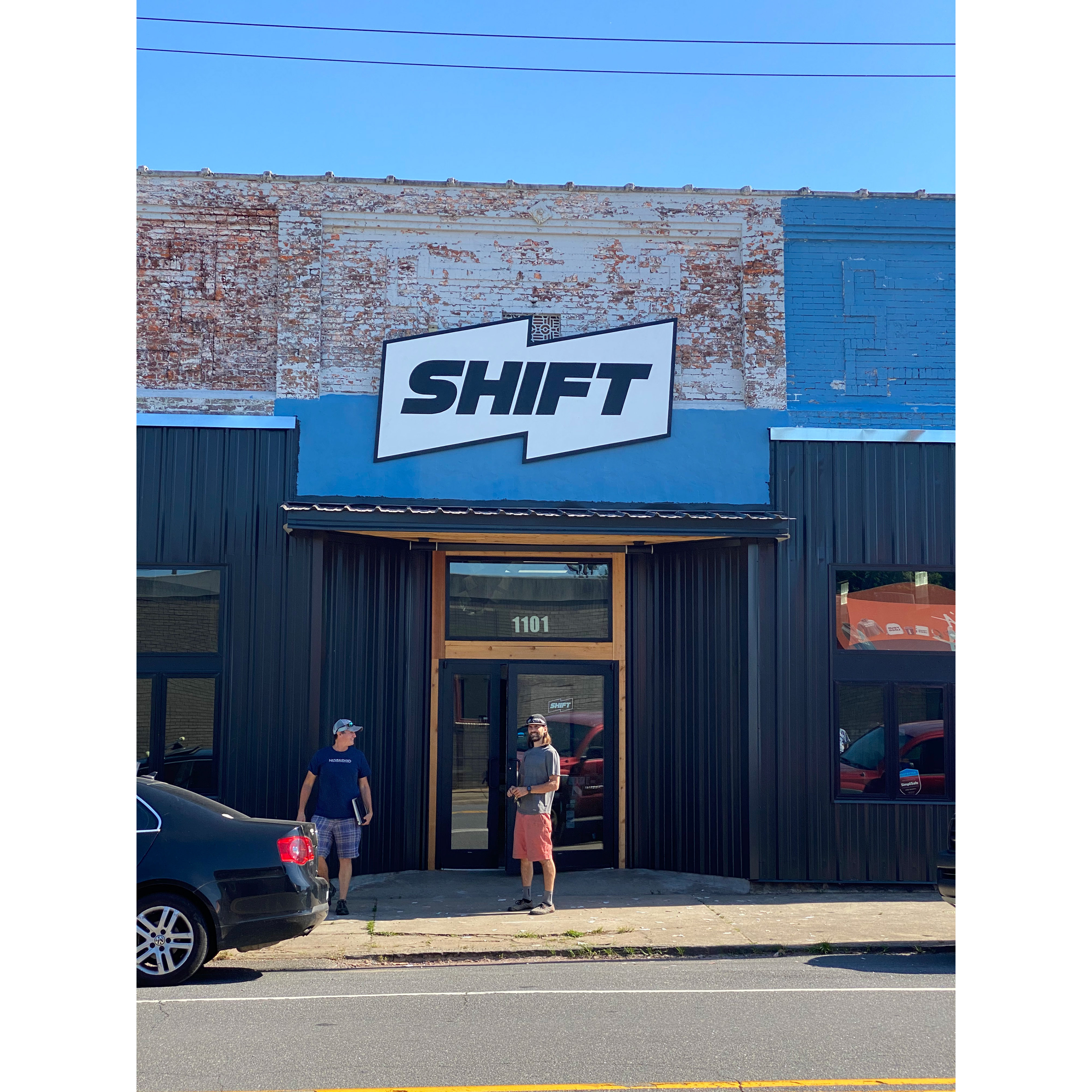
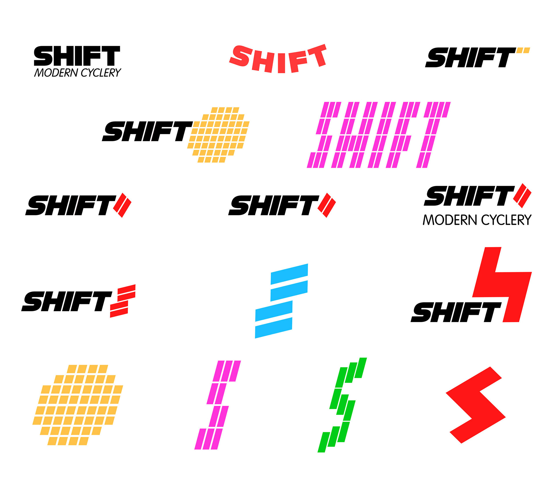
Shift Modern Cyclery Logo and Mural
2022, Logo Design and Mural for
Shift Modern Cyclery
, Little Rock, Arkansas
You may also like
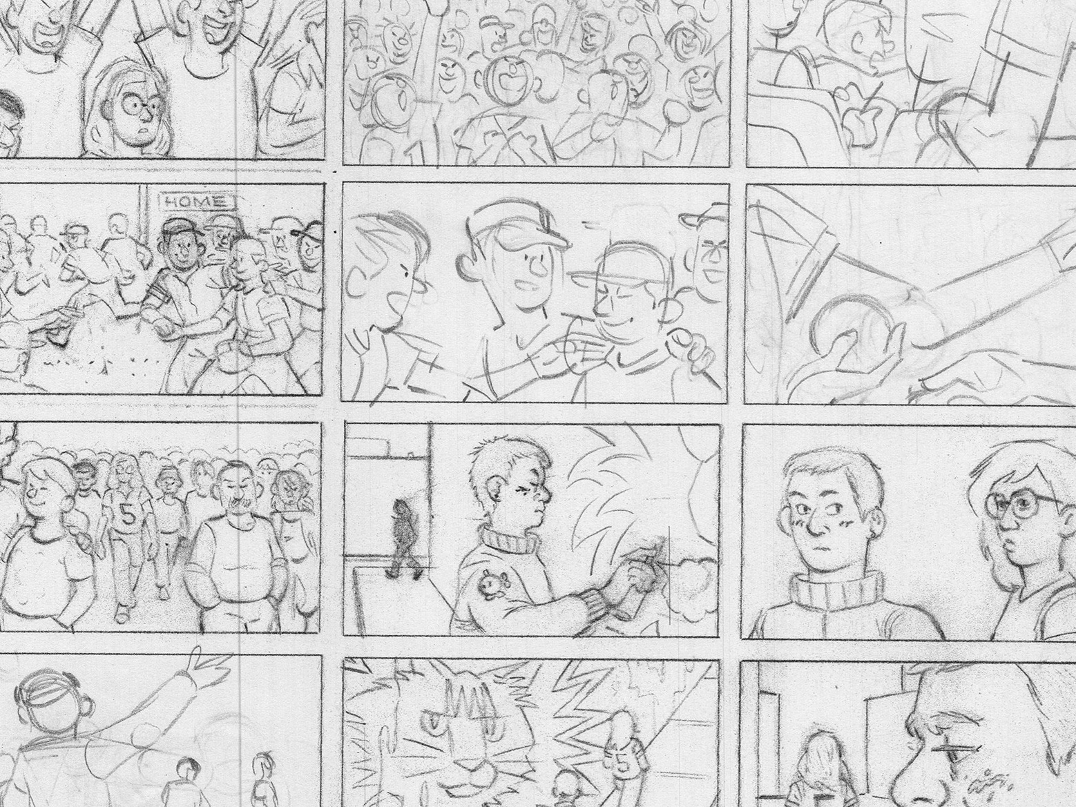
Aha! Storyboard
2023
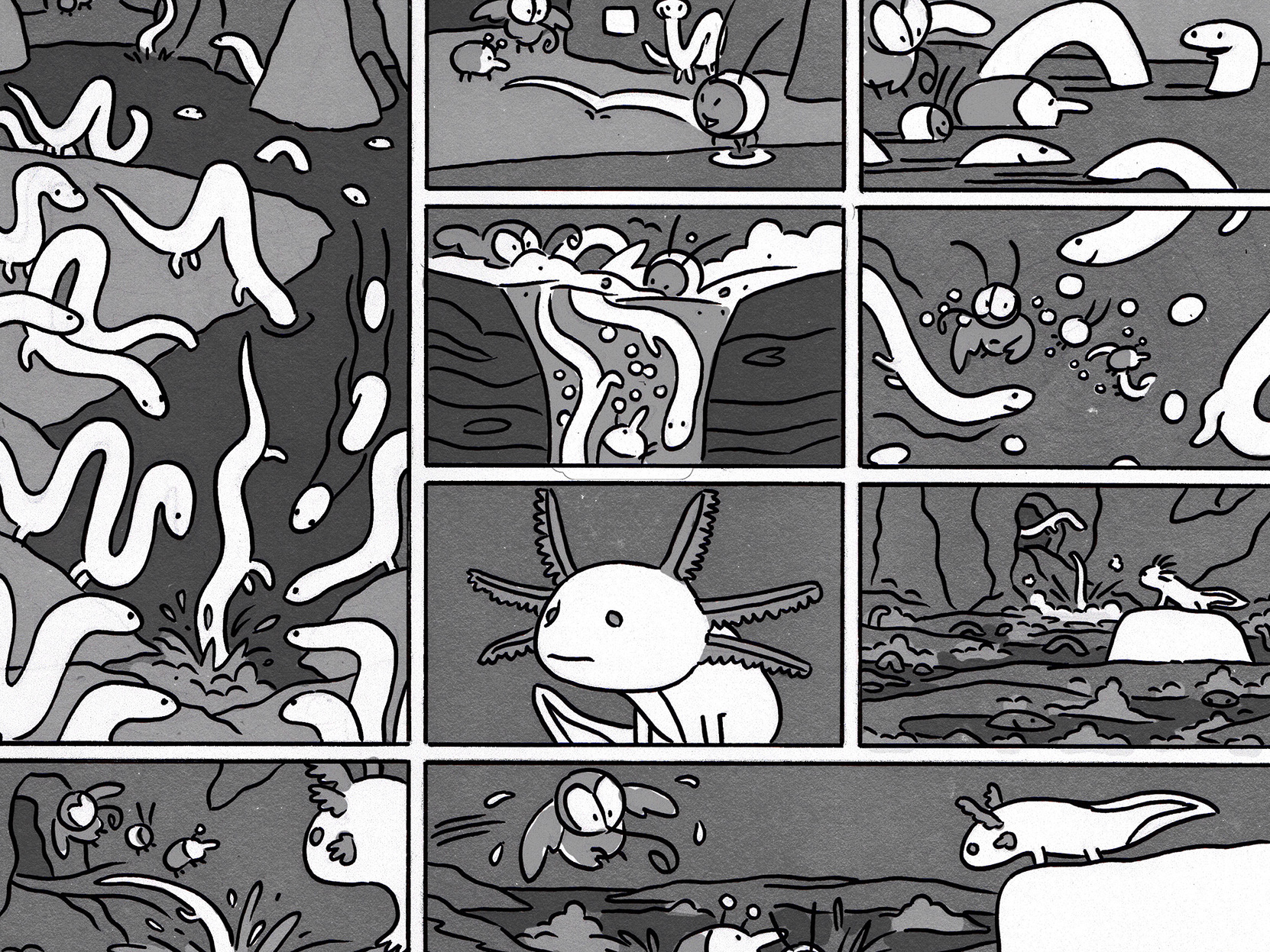
Sick Day Comic
2022
Memphis Bridge Crack
2022
Schlep Van Wraps
2025
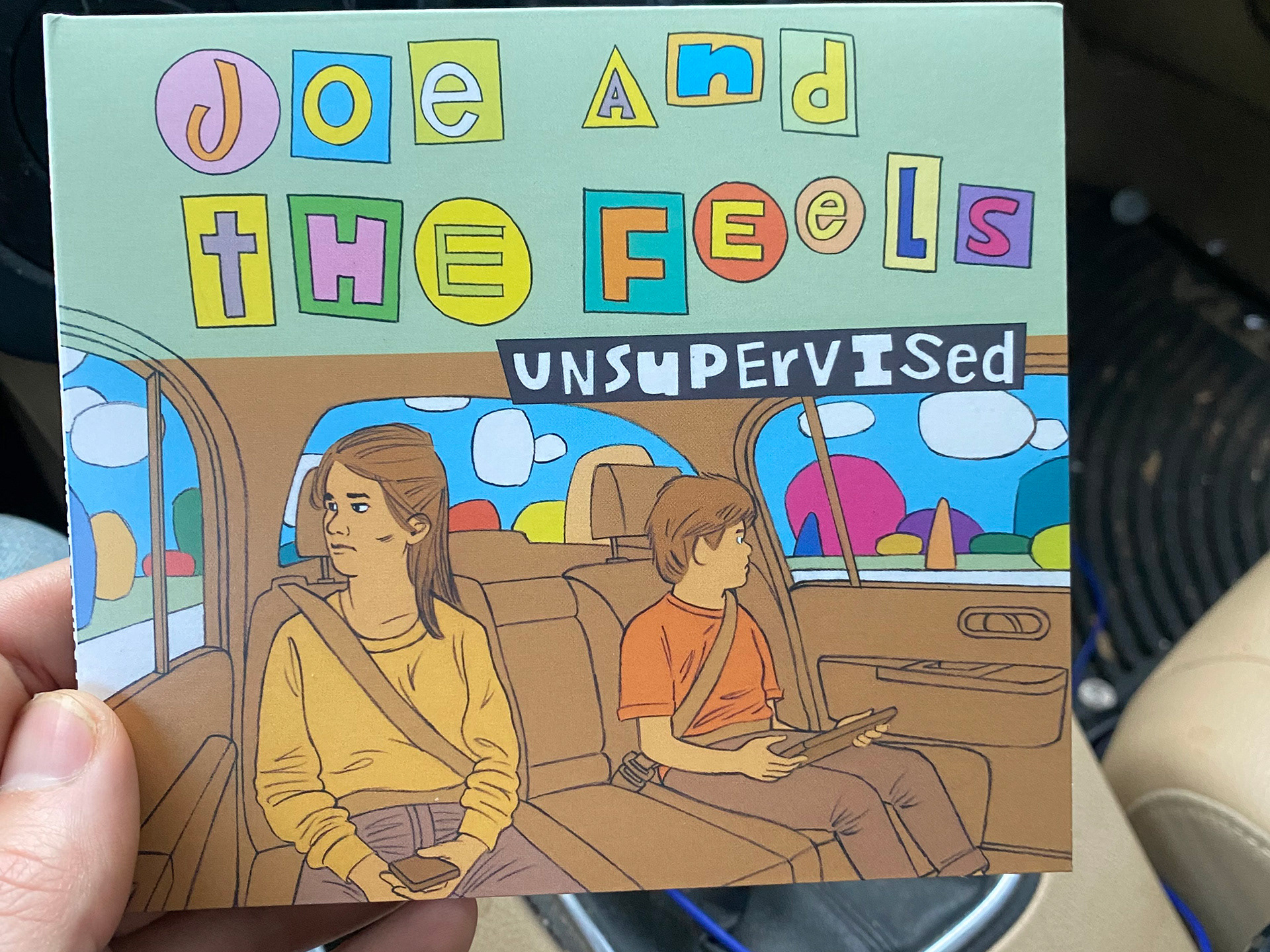
Joe and The Feels
2021
Manga Summer at Cajun Sno (Little Rock, AR)
2021
Steam Powered
2024
Big Woods for Amazonia
2021
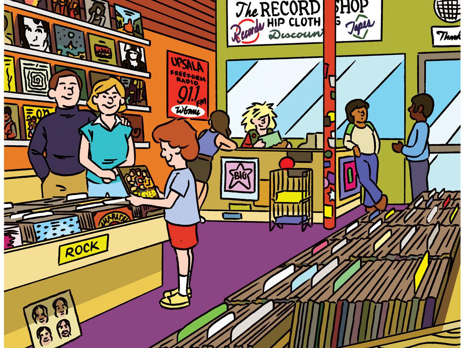
WFMU pledge drive activity book
2023
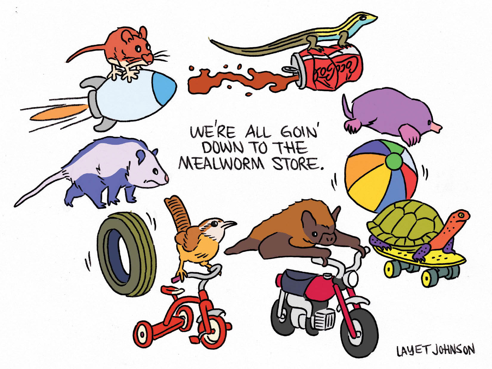
Sulphur Springs Truck Patch Postcard Art
2023
↑
Back to Top